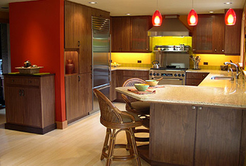
“These clients’ previous space was color-oriented as well, but smaller and very busy. They wanted to continue living with color, but he was less certain about using the vibrant shades that she loved. We reached a consensus by doing the kitchen and hall areas in tangelo and bright red, with the sink area and the rest of the walls throughout the space done in soft, mossy green. This made most of the space live quietly, with the vibrancy happening where the action was.
“We brought in dark wood cabinets to bring a sense of peacefulness to the space. When you combine bright, saturated colors and light wood, you get a lot more energy. It’s bright/happy/cheerful, but what we wanted was living with color for the beauty of color, at a more comfortable energy level. Light woods would have allowed the color to be overpowering, whereas the deeper tones soothe the space.
“We balanced the dark cabinets with natural bamboo, which kept the space from going somber. The countertops were the segue; as a mid-tone, they created a bridge between the cabinets and flooring so that we didn’t have too much contrast.”
Designer: Kathie Maughan
Maughan Design, Inc.
Portland, Oregon
maughandesign.com